


As the first designer at Neighborhoods.com, one of my earliest tasks was to create the logo for the new brand. The process started by interviewing the company owners to get a clearer understanding their vision of how this website would fit into the real estate landscape and who they saw as direct and indirect competitors. This was followed by benchmarking and competitive analysis to understand who the competition is and how they position themselves in the market. Samples of some of the benchmarks are listed below.
+ What does the word “neighborhood” mean to people?
+ How do you represent a “neighborhood” in an image?
+ How does your background effect what you think of as a “neighborhood”?
+ How do you take something as complex as a “neighborhood” and make it simple?
Role: Discovery, Designer
Real Estate is a $70B market with a number of very large and well established players. I started the project by looking at the current players, both big and small, and looking at ancillary verticals like travel.
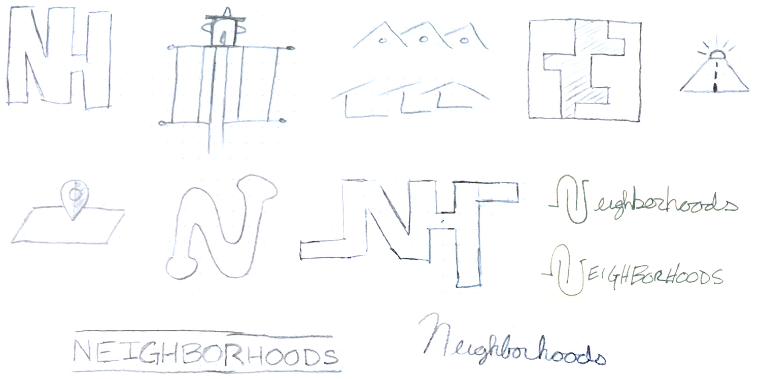
Hearing the work “neighborhood” instantly brings images to your mind, but those images are all shaped by an individual’s experience. How do you capture what a neighborhood is in a logo? Pencil to paper and lots of exploring.
Dozens of sketches were narrowed down by reviewing them with the business owners, real estate agents and people not associated with the business. The ones that resonated the most began a refining process.
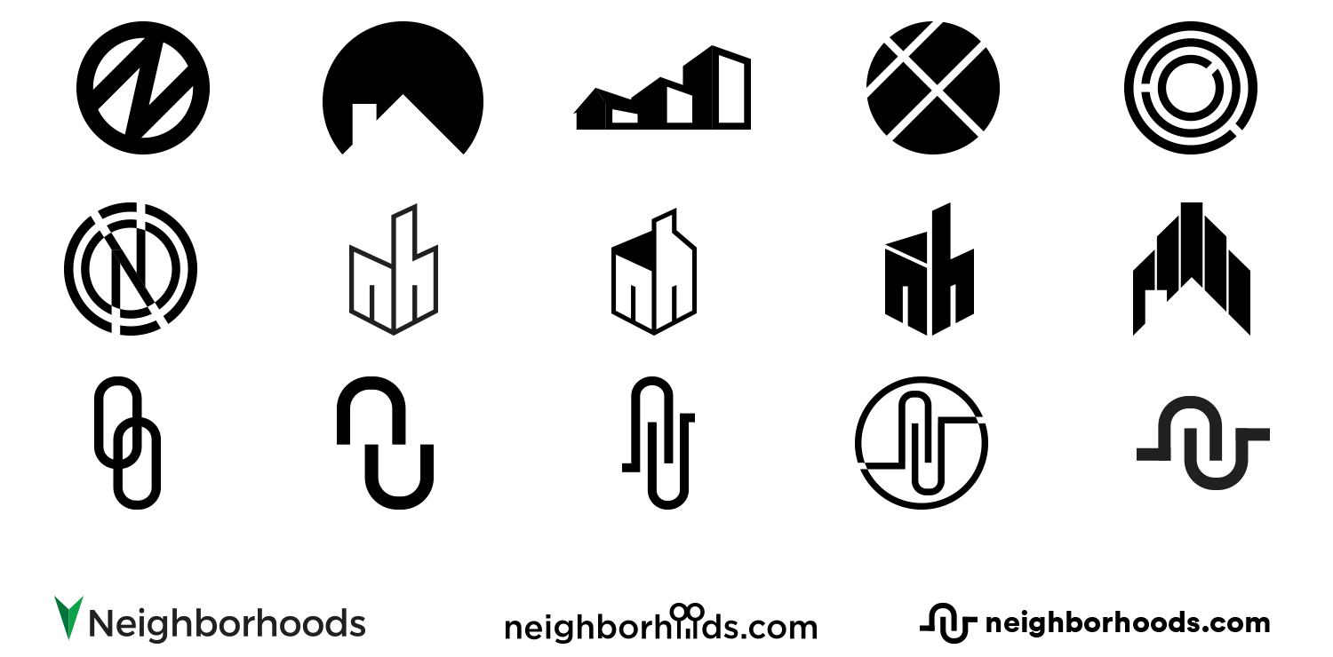
A few more rounds of iteration and the final direction for the wordmark is agreed upon. The icon is descriptive of two hands coming together and the winding streets and cul-de-sacs found in some suburban areas.
The process took about a week to complete. When we got the company together, about 20 of us, to review the final options, it was pretty amazing that the final direction was selected by 90% of the people there.
Even more amazing were the comments I received from a number of team mates that they could not believe a logo could be created in 5 days that would represent the business and they were excited to stand behind.