neighborhoods.com
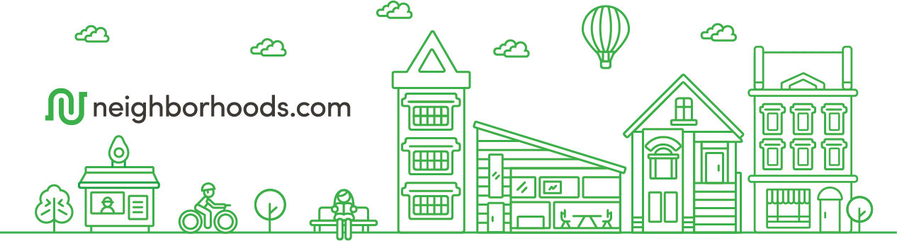
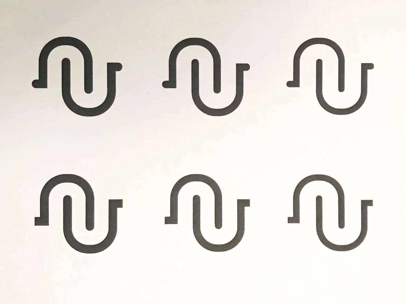
Your house is your home, but you live in your neighborhood. The logo mark represents the intertwining streets of neighborhoods and two hands coming together, as neighbors. As Founding Designer, I created a brand and designed the information architecture and UX for neighborhoods.com in five months.
Role: Founding Designer // Creative Director
From the interviews and research, some key questions were identified:
+ What does the word “neighborhood” mean to people?
+ How do you represent a “neighborhood” in an image?
+ How does your background affect what you think of as a “neighborhood”?
+ How do you take something as complex as a “neighborhood” and make it simple?


The Competitive Landscape
Real Estate is a $70 billion market with numerous huge and well-established players. I began the project by examining the current players, both large and small, and exploring ancillary verticals such as hotels and travel.

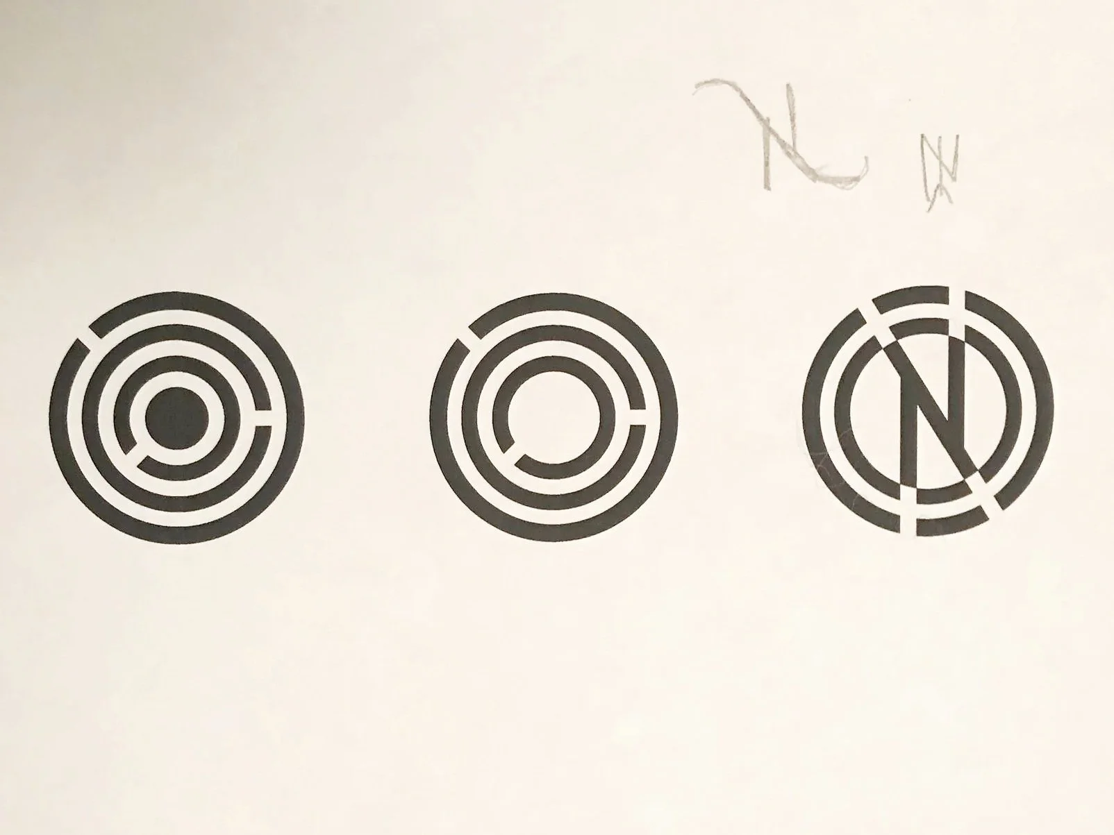
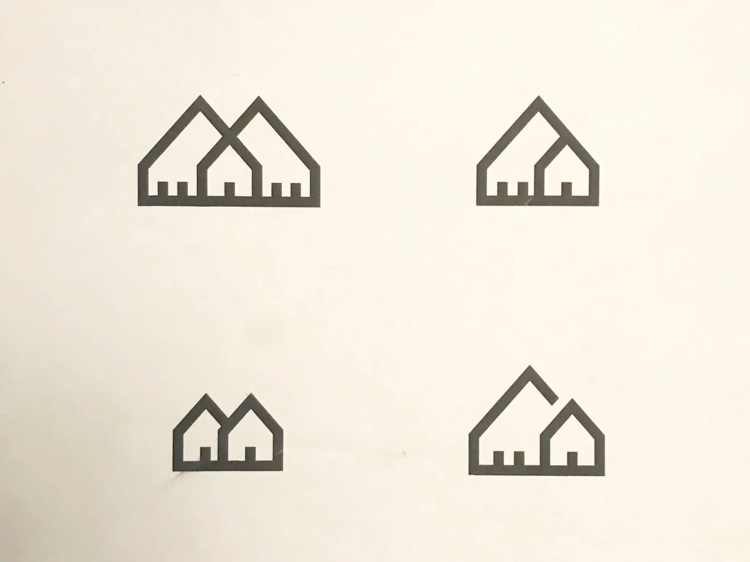
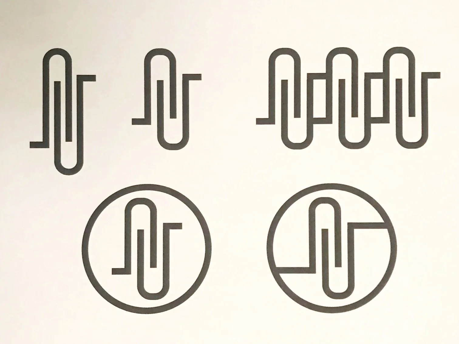
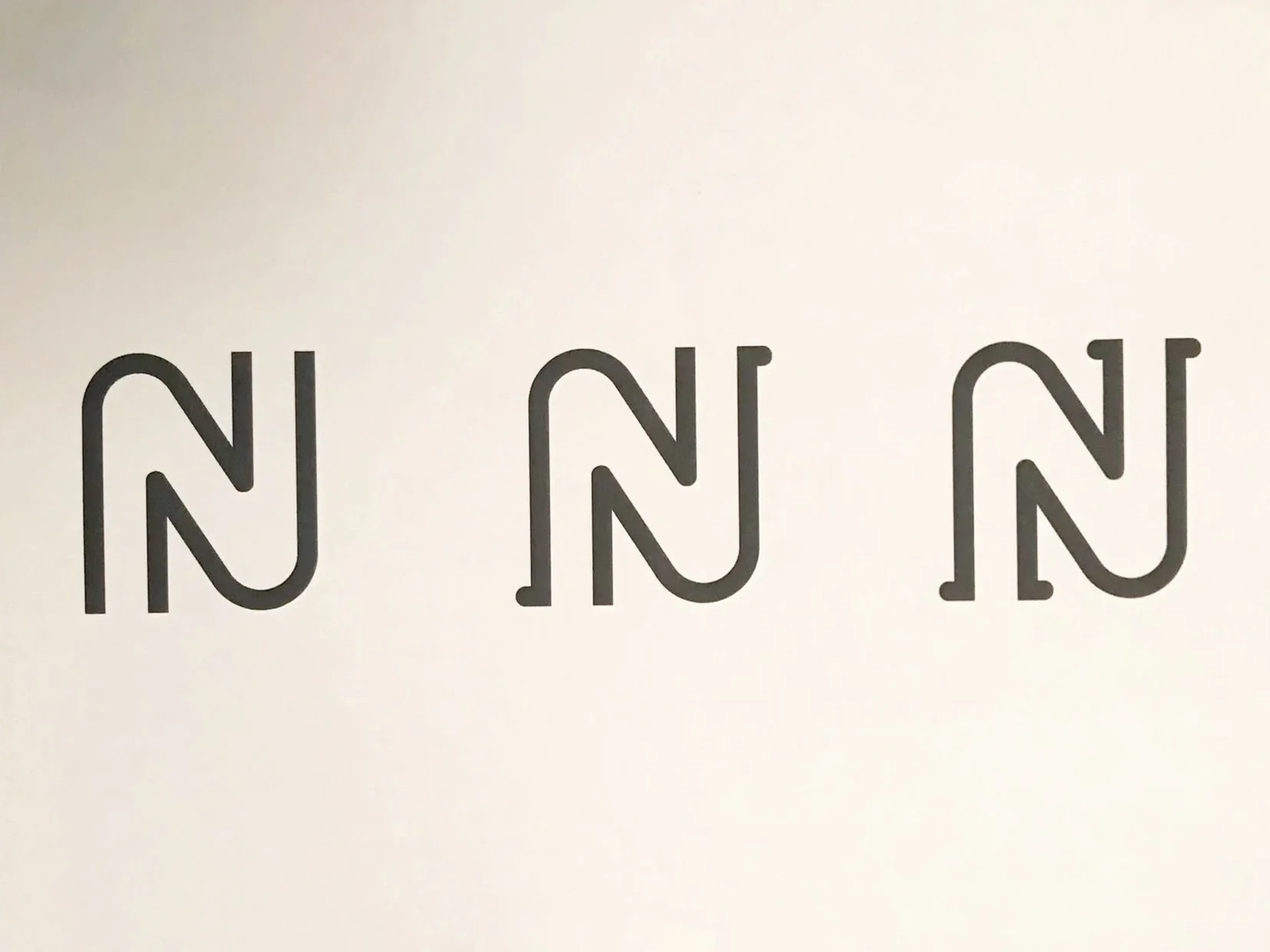
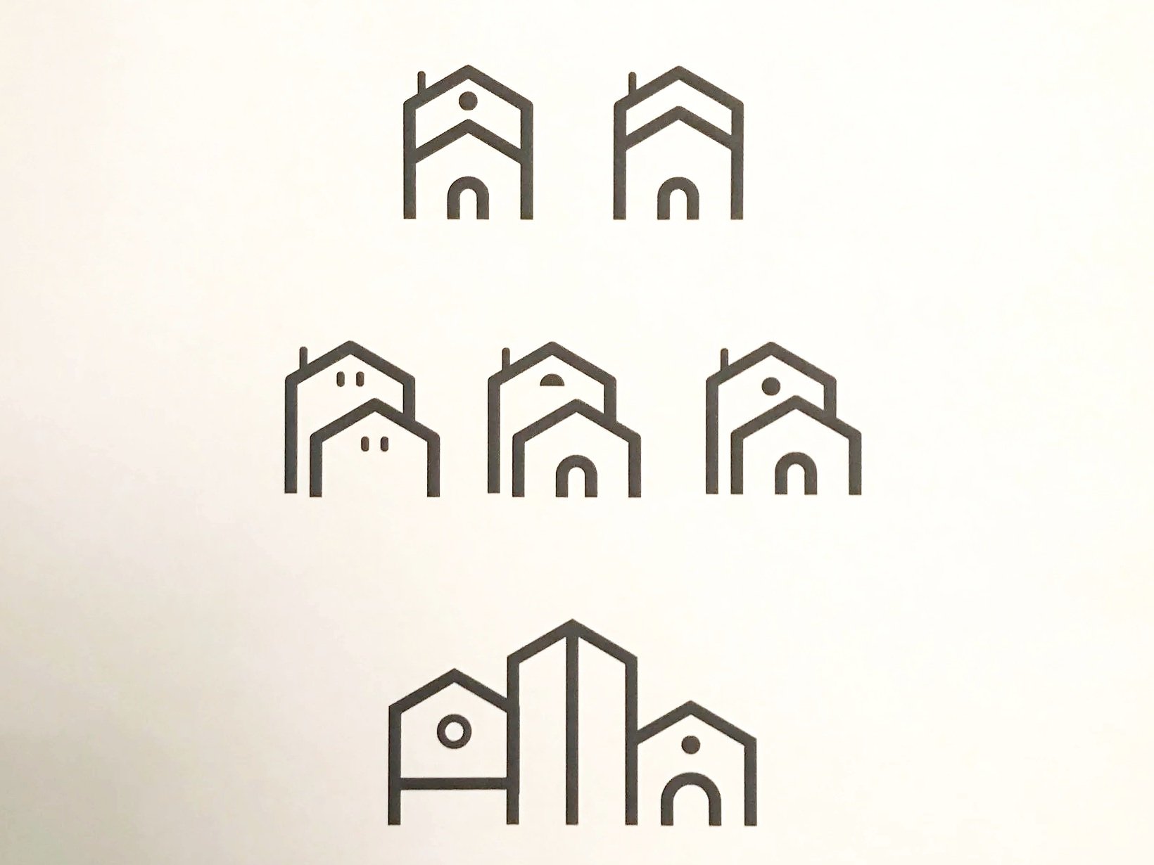
Digital sketches of logo variations to capture the idea of “what do people think of as a neighborhood?”
Hearing the word “neighborhood” instantly brings images to your mind, but those images are all shaped by an individual’s experience. How do you capture the essence of a neighborhood in a logo?
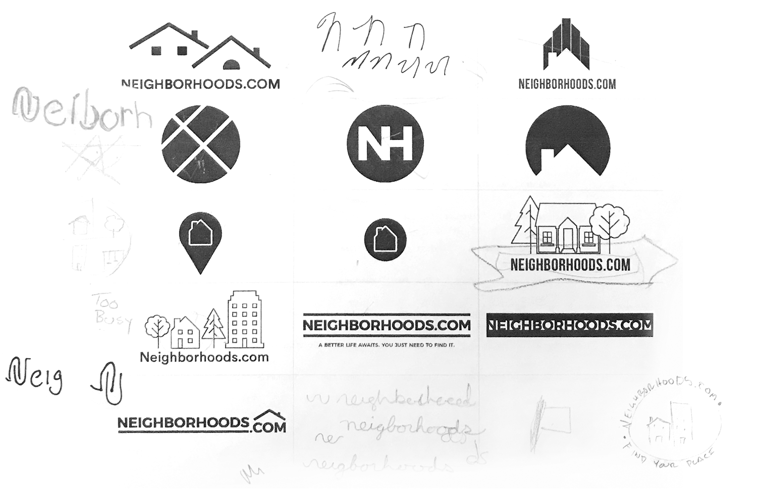
Logo explorations were refined and shared with stakeholders. The process took about a week to complete. When we brought the company together, including some of our real estate agents, comprising about 40 people in total, to review the final options, it was remarkable that the final direction was selected by 90% of the group.
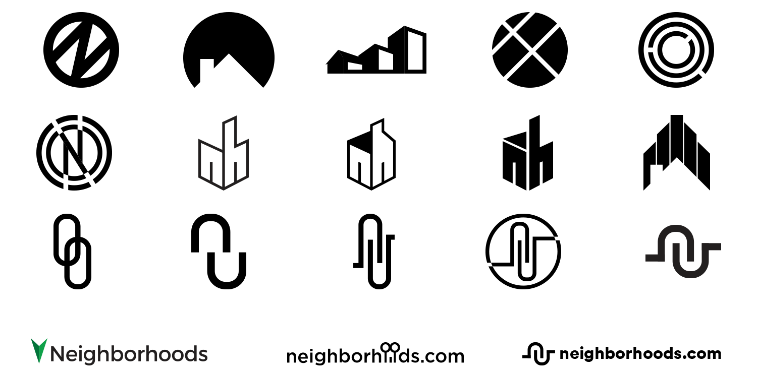
The icon depicts two hands coming together, along with the winding streets and cul-de-sacs found in many overhead photos of new housing developments.
